Creating a 10,000+ px interactive web canvas
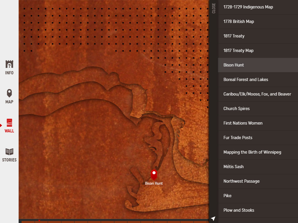
When I began working on the Upper Fort Garry (UFG) app (which you can read more about here) one of the features needed was a way to explore the 400 ft. steel wall on a mobile device. On a device the wall can be 10,000 – 30,000+ pixels wide. I quickly realized it was going to be an interesting challenge to have that scale of imagery perform smoothly. This is the first hybrid app I’ve worked on and the first time using with some JS libraries I’ve never used before and… Well there was a lot of firsts and that’s what made it challenging and exciting.
Default Browser Scrolling
The first thing I tried was to simply plop the images in a <div> and float the images left. Done. Right? Well here is how that turned out:
See the Pen Scrolling Wall V1 by Pattern Interactive (@Pattern-Interactive) on CodePen.
Note this example is “bare bones” without the overhead of the rest of the app. Even so this takes up a signification amount of memory and processing power to render when scrolling quickly. Older and less powerful devices like the an iPod (5th Gen) or iPhone 4 scrolling quickly causes momentarily blank spots as the device tries to keep up with rendering the images. In some cases the application would outright crash.
Well that’s no good 🙁
Leaflet
I had considered using Leaflet as means to pan around the wall. A pretty solid library but when panning there is a slight delay when loading in tiles and we wanted to have it load instantaneously.
Enter HTML5 canvas.
The next idea was what if we drew the images on a canvas? There are some neat interactive applications out there that use this technology. Just check out this one. If that can perform fairly well surely we can make our ‘simple’ scrolling wall perform somersaults.
“Wall versions A through G were complete failures! But wall H feels good on the whole…”
There were actually quite a few iterations of the wall as I experimented before I developed the final version. At first I tried simply drawing the whole wall on a single canvas to see what that would do. It crashed. Canvases have a maximum size depending on the browser – see here. It didn’t matter what was drawn if the canvas element exceeded it’s max dimensions, the end result was still a crash. as well, drawing images beyond the defined boundary of a canvas will still use significantly more resources. For example, drawing a 1’000px by 10’000px image within a a 300px by 300px canvas, still renders the entire image.
As a solution I would have to figure out how to draw only a portion of the wall, detect when a user was attempting to scroll and redraw the wall with the correction sections showing.
Into the Code
Let’s get more into the code and start with the basics and work our way up. In this example we start by simply drawing an image on the canvas (read the comments in the code for additional details):
See the Pen Scrolling Wall V2.0 by Pattern Interactive (@Pattern-Interactive) on CodePen.
Scaling the Wall
Okay, that was pretty straight forward. Now I want the canvas to fill the entire screen whatever the device size:
function resize_canvas() {
  var winWidth = $('body').outerWidth();
  var winHeight = $('body').outerHeight();
  c[0].width = winWidth;
  c[0].height = winHeight;
}
// immediately resize canvas
resize_canvas();

// resize canvas again if window is resized
var debounce_resize;
$(window).on('resize orientationchange', function(){
  // The timeout acts as a debounce as well has a timeout for mobile devices as they take about 2-300 ms to complete an orientationchange
  clearTimeout(debounce_resize);
  debounce_resize = setTimeout(function(){
    resize_canvas();
    // we have to redraw the canvas as what is on it may be stretched
    if( image_ready ) { // make sure the image has been loaded
      draw();
    }
  }, 300);
});
Note how I set the canvas dimensions via the canvas HTML element’s attributes and not the CSS attributes.
// do this
c[0].width = winWidth;
c[0].height = winHeight;
// and not this
c[0].style.width = winWidth+'px';
c[0].style.winHeight = winHeight+'px';
// and not this (jQuery equivalent)
c.css({
  width: winWidth+'px',
  height: winHeight+'px'
});
The element’s attributes are needed for the canvas to know the size of the canvas. The CSS equivalent attributes will tell the browser how large to display the canvas but won’t tell the canvas how big of a box it can draw in. That may be a little confusing at first but if you play around with it you’ll understand. Also, setting both the HTML and CSS width and height attributes can effect the scale and therefore quality of what’s drawn.
See the Pen Scrolling Wall V2.1 by Pattern Interactive (@Pattern-Interactive) on CodePen.
You may have noticed that the image drawn is way to large to fit in the canvas at smaller resolutions. And if you played with the width and height attributes you may have already figured out how to solve that. Unlike an <img> tag where the browser will automagically scale proportionally if it’s height/width is set to auto, the canvas dimensions needs to be defined.
We know that the dimensions of the wall images and the canvas can be different. But we also know that since the wall will be horizontally scrolling the full height of the wall images will always be the height of the device. Knowing this we can use the actual height of the images and the height of the canvas to create a ratio to proportionally scale the images:
// canvas height
var wallHeight = c.height();
// the ratio
// note wall_image_data variable was stored earlier in when the image was loaded in
var img_height_ratio = wallHeight / wall_image_data.imgHeight;

With that we can draw the image like so:

ctx.drawImage(wall_image_data.img, 0, 0, wall_image_data.imgWidth*img_height_ratio,wall_image_data.imgHeight*img_height_ratio);
Neat! Now how about “scrolling” to see the rest of the wall?
iScroll:
The idea of creating custom functions to track user gestures to simulate scrolling on the canvas seemed like reinventing the wheel. That’s where iScroll comes in. The library is battle tested and provided all the functionality I could ask for, but how could I combine the two?
After some thought, there are 3 main tasks I could see:
- Create on overlay with iScroll to capture user gestures
- load all images before scrolling – we will need to create function to loop through all the image and tell us when they are loaded, And
- Create some logic in the draw function to know which images to draw and where.
Setting up iScroll
Let’s start by adding the iScroll library (we need the probe version for all it’s features):
<script src="path/iscroll-probe.js"></script>Add a an HTML for the overlay (iScroll needs a wrapper element and a child element with all its content inside):
<div id="wallScrollerWrap"> <div id="wallScroller"></div> </div>Some styling:
body {
  position: absolute;
  width: 100%;
  height: 100%;
  margin: 0;
  padding: 0;
  overflow: hidden;
}
#wallScrollerWrap {
  position: absolute;
  z-index: 1;
  top: 0;
  left: 0;
  width: 100%;
  height: 100%;
}
#wallScroller {
  border: 10px dashed blue;
/* Just so we can see that the scrolling is working, we can remove it after */
  width: 10000px;
  height: 100px;
}
Now to initialize iScroll:
var wallScroll = new IScroll('#wallScrollerWrap', {
	probeType: 3, // (1,2, or 3) 3 being the most accurate option (required for certain features) but also the most resource demanding option
	zoom: false,
	zoomMax: 1,
	scrollX: true,
	scrollY: false,
	mouseWheel: true, // allows scrolling with mouse wheel
});
See the Pen Scrolling Wall V2.2 – iScroll by Pattern Interactive (@Pattern-Interactive) on CodePen.
Okay, let’s try to get the wall to move now. We will need to trigger the draw function on scroll and pass it the position scrolled to:
wall_image.onload = function(){
...
  // add scroll event once the image is ready to be scrolled
  wallScroll.on('scroll', function(){ // remember we need "probeType" set to 3 or this event won't work
    draw(this.x); // "this" contains iScroll event data
  })
...
};

function draw(x){
...
  // clear canvas or it will show what you last drew
  ctx.clearRect(0, 0, c[0].width, c[0].height);
  // draw image with new position
  ctx.drawImage(wall_image_data.img, x, 0, wall_image_data.imgWidth*img_height_ratio,wall_image_data.imgHeight*img_height_ratio);
...
}
See the Pen Scrolling Wall V2.3 – iScroll by Pattern Interactive (@Pattern-Interactive) on CodePen.
Setting up the images
Great! Now let’s get the rest of wall moving. We have to start by loading up all of the other sections of the wall:
We will want to store the images in an array that maintains the display order – this will make it a bit easier to determine which image needs to be drawn later. One approach this a for loop but the images can finish loading at different times. The smarter method is to load them in sequence in the wall_image_urls variable.
We do this by creating a function to load a single image, then once the onload() event of that image triggers, we load the next image.
Here is what that looks like:
var wall_image_data;
var img_counter = 0;
var wallScrollerWidth = 0;
function load_wall_imgs(img_counter){
  wall_image = new Image();
  // make sure you add the onload event before the src or the image may load be fire this func is defined
  wall_image.onload = function(){
    imgWidth = this.width;
    imgHeight = this.height;

    // store image obj in array
    wall_image_data = {
      img: this, // image obj to be drawn by canvas
      imgWidth: imgWidth,
      imgHeight: imgHeight
    }

    if(img_counter >= wall_image_urls.length){ // check if we are on the last image
      image_ready = true;
      // added scroll event
      wallScroll.on('scroll', function(){ draw(this.x); })
      // draw the image
      draw(0);
    } else {
      img_counter++; // increment to next image
      load_wall_imgs(img_counter);
    }
  };
  wall_image.src = wall_image_urls[img_counter];
}
Next we need to add logic in the draw function to know which image to draw when the screen is scrolled. To do this we need to know the position of each image (see comments in the code for details):
// since the images drawn will be scaled to fit the device we need take that into account
var img_posX_start_ratio = c[0].height / imgHeight;
    img_posX_start = imgWidth * img_posX_start_ratio;

// current width of the wall which is also the starting position for the next image
wallScrollerWidth += img_posX_start;

// store image data in array
wall_img_obj = {
    img: this, // image obj to be drawn by canvas
    imgWidth: imgWidth, // width of image after resized to fit on screen
    imgHeight: imgHeight,
    sx: wallScrollerWidth // px position alone the wall (imagining it is one wall with imgs side by side)
}
wall_images.push(wall_img_obj)
Now we have to go through an array of images with conditional statements to see if we need to draw the image at the start or end of the canvas.
function Draw(x) {

  // clear canvas
  ctx.clearRect(0, 0, c[0].width, c[0].height);

  // end position of the canvas
  var canvasEnd = c[0].width;

  // loop through our images
  for (var i = 0; i < wall_images.length; i++) {

   var img_posX_start;
   // if it's not the first image on the wall add the width of the previous image to it's position so they don't overlap
   if( i > 0 ) {
     img_posX_start = wall_images[i-1].sx + x;
   } else {
     img_posX_start = x;
   }

   // use the image-to-wall ratio to know the starting position of images depending on device size
   var img_posX_start_ratio = wall_images[i].imgHeight / wallHeight;
   img_posX_start = img_posX_start * img_posX_start_ratio;

   // if the image should be in view we draw it
   if( wall_images[i].sx + wall_images[i].imgWidth + x > 0 && img_posX_start + x < canvasEnd ) {
      // use img_posX_start_ratio to
      ctx.drawImage(wall_images[i].img, img_posX_start, 0, wall_images[i].imgWidth*img_posX_start_ratio,wall_images[i].imgHeight*img_posX_start_ratio);
    }
    // if the start of current image position isn't before the canvas end, we need not go further break out.
    if( img_posX_start + x  > canvasEnd ) {
      // AHHHH... BREAK OUT!  Le Break, c'est chic!
      break;
    }
  };
}
The final piece to revise is the resizing function. Since resizing or changing the orientation of your view will change the size of the images and the wall, we will need to adjust accordingly. All we have below is a loop to set to starting position of the images, it is the exact code that is used in the load_wall_imgs function. And the other bit is simply resizing the iScroll enabled element.
function resize_canvas() {
...
  // reset image starting positions
  if( image_ready && wall_images.length > 0 ) { // check that the images have been loaded
    wallScrollerWidth = 0;
    for(i=0; i < wall_images.length-1; i++){
      imgWidth = wall_images[i].imgWidth;
      imgHeight = wall_images[i].imgHeight;

      // since the images drawn will be scaled to fit the device we need take that into account
      var img_posX_start_ratio = c[0].height / imgHeight;
      img_posX_start = imgWidth * img_posX_start_ratio;

      // current with of the wall which is also the starting position for the next image
      wallScrollerWidth += img_posX_start;
      wall_images[i].sx = wallScrollerWidth;
    }
  }

  // set width of iScoll overlay
  document.getElementById('wallScroller').style.width = wallScrollerWidth+'px';
  // refresh iScroll so it knows the changes
  wallScroll.refresh();
  wallScroll.scrollTo(0);
}
We now have a fully functional image scrolling canvas. And here, of course, is the CodePen for it:
See the Pen Scrolling Wall V2.4 by Pattern Interactive (@Pattern-Interactive) on CodePen.
Enhance, enhance, enhance.
There were a few other ideas that I explored in effort to maximize performance and image quality. One of the performance ‘enhancements’. I experimented with was to load up all the images and base 64 encode them with the canvas.
canvas.toDataURL('image/jpeg',1.0)But even setting the quality parameter to its highest (1.0) toDataURL() , there was still a lose of image quality. Instead, for the best quality I found that drawing a larger image on to a smaller canvas. Which is actually what we’re already accomplishing this by using the img_posX_start_ratio to scale down the large 1024px images for mobile devices.
I had though since the wall guide in the app would only be landscape enabled, I could draw all the images to the canvas once and take a snapshot with toDataURL() to get the exact sizes. This way I don’t have to worry about the image aspect ratio and draw them as is. Additionally for devices like an iPod which aren’t 1024 px tall in landscape I won’t have to store the larger version of the images. While scrolling seemed silky smooth there was now a much longer initial loading time. And, as I mentioned, even setting the second parameter to 1 which tells it to use high quality the images still ended up a bit pixelated and was quite noticeable on retina screens.
Note: if your having trouble with image quality on canvases this article may be a worth a read: https://www.html5rocks.com/en/tutorials/canvas/hidpi/
Momentum
A quick but important note about iScroll. iScroll has has an attribute called deceleration which adjusts the amount of momentum when scrolling. I found that I decreasing the deceleration time – and therefore decreasing the amount of momentum – had a significant impact improving performance, especially for certain mobile devices.
Finally we have a re-sizable 10,000+ px scrolling wall. In some ways it seems kinda simple now but at the time it was an exploratory process. This of course doesn’t include GPS which was added later. I had a fun getting scrolling to work correctly with all the different mobile devices we needed to comply with and hope this helps you with your project.
Check it out
The final working version of the UFG wall can be seen on the mobile app or on the UFG website. We also went on to use this same technology in the Great War memorial installation where people could look through a list of 65,000+ names. You can read more about that here.