Making Civic Participation Easier to Navigate
Pattern in Practice: How we helped turn electoral boundary data, public feedback, and interactive mapping into a clearer consultation experience.
Some public processes are hard to understand because the subject is complex.
Others are hard to understand because the information lives in too many places.
For electoral boundary reviews, both are true.
There are maps.
Population numbers.
Deviation calculations.
Public hearings.
Written submissions.
Proposed changes.
Final reports.
Legal requirements.
Communities trying to understand what a new line on a map might mean for them.
The work is technical, but the impact is personal.
A boundary change can affect which electoral division someone belongs to. It can affect how communities are grouped, represented, and understood within a larger democratic process.
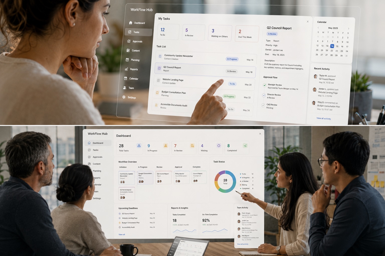
That was the challenge behind the Boundaries Commission website.
The goal was not simply to publish information online.
The goal was to make a formal public consultation process easier to understand, easier to explore, and easier to participate in.
At its core, this was a public consultation website design challenge: turning complex civic data, maps, hearings, submissions, and bilingual content into a clearer public experience.
For Part 1 of this series, we looked at tourism UX and how Explore the Whiteshell made a region easier to search.
For Part 2, we looked at digital interpretation and how the Manitoba Oil Museum made complex history easier to explore.
Part 3 moves into civic participation.
The context is different, but the pattern is familiar: when information is complex, the digital experience has to create clarity without removing the depth of the process.
Project Snapshot
Project: Boundaries Commission website
Sector: Government / civic technology / public consultation
Services: Website development, UX strategy, information architecture, interactive mapping, bilingual content structure, public submission workflows
Core Challenge: Make a complex electoral boundary review easier for the public to understand, explore, and respond to
Primary Users: Residents, community groups, public hearing participants, journalists, researchers, commissioners, administrators
Live Site: Visit Boundaries Commission website
What Pattern delivered:
Public consultation website for the electoral boundary review process
Content structure for process information, commission members, news, hearings, FAQs, reports, and supporting data
Interactive map experience for exploring electoral division boundaries
Boundary layer comparison for existing, proposed, and final boundaries
Public submission forms connected to specific electoral divisions
Hearing registration support within the feedback process
Administrative tools for reviewing and exporting submissions
English and French content management structure
Staff-friendly CMS foundation for updates throughout the consultation lifecycle
The result:
Residents could better understand proposed boundary changes
Users could compare boundary layers visually instead of relying only on documents
Public feedback became easier to submit and manage
Bilingual access supported a more inclusive consultation process
The website connected maps, data, hearings, submissions, reports, and administrative workflows into one clearer civic experience
The project helped make civic participation easier to navigate
The Tension: Public input depends on public understanding
Public consultation only works when people can understand what they are being asked to respond to.
That sounds simple.
In practice, it is difficult.
Electoral boundary reviews involve geographic data, population statistics, existing boundaries, proposed changes, archived maps, public hearings, legislation, submissions, and final recommendations.
For a commission, all of that information has to be accurate and complete.
For the public, it has to be understandable.
Those are different needs, and the website had to support both.
A resident may arrive with one question:
Which electoral division am I in?
Someone else may want to compare an existing boundary with a proposed one.
A community group may want to understand how population numbers affect a proposed change.
A participant in a public hearing may want to submit feedback, register to speak, or review supporting documents before attending.
A journalist, researcher, or public-sector stakeholder may want access to reports, data, maps, and historical context.
The challenge was creating one digital experience that could serve all of those users without making the process feel more complicated than it already was.
The existing experience made comparison difficult. Visitors needed a better way to see existing, proposed, and final boundaries in relation to one another. They also needed a clearer path to understand the process, review data, and provide input.
That is where civic UX becomes important.
A public-sector website is not just a container for documents. It is part of the process itself.
If the experience is confusing, participation becomes harder.
If the experience is clear, people have a better chance of understanding what is happening and how to respond.
The Pattern Solution: Turning civic data into usable pathways
The Boundaries Commission website needed to bring several pieces together into one coherent experience.
This kind of website development requires public-facing clarity, administrative usability, and long-term content flexibility.
There was the public-facing content: process information, commission members, news releases, public hearing schedules, FAQs, reports, and supporting data.
There was the administrative side: content management, public submissions, exports, updates, bilingual publishing, and staff training.
And there was the interactive mapping layer: the part of the experience that allowed visitors to explore electoral division boundaries visually.
Our approach centered on structure.
We provided the content management foundation, giving staff a manageable way to update pages, publish news, organize commission content, and maintain English and French versions of the site.
That mattered because public consultation websites are active for a specific process, but they often need to change throughout that process.
Early on, the site may need to explain the commission’s goals and upcoming public hearings.
Later, it may need to publish proposed boundaries.
Then it may need to support public submissions.
Eventually, it may need to present the final report and help people understand what changed.
The content structure had to support that full lifecycle.
A static website would not be enough.
The experience needed to move with the process.
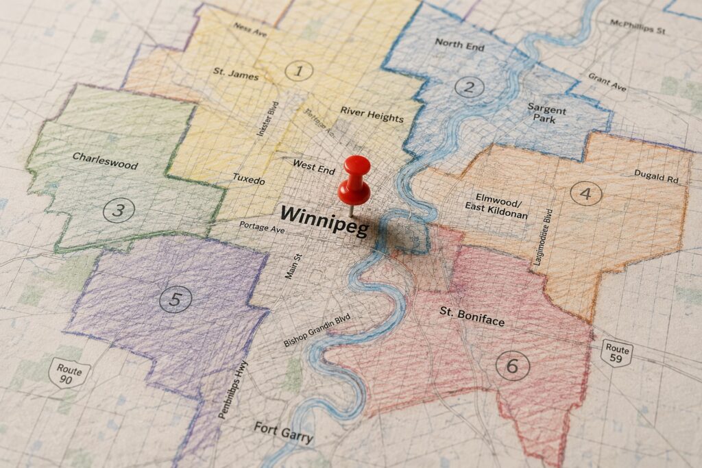
Why interactive mapping mattered
Maps were the core of the project.
Electoral boundaries are hard to understand as text alone. A written description can explain a boundary, but a map helps people see where that boundary sits, what it includes, and how it relates to neighboring divisions.
The website was designed to let visitors compare different boundary layers in a single interface.
Existing boundaries.
Proposed boundaries.
Final boundaries.
Instead of asking people to open separate files or compare maps manually, the platform brought those views together. Visitors could toggle layers, select electoral divisions, zoom into specific areas, and review related information.
That kind of interaction changes the experience.
It helps people move from reading about a proposed change to seeing it.
The mapping system was also designed around geographic data. That meant the platform could connect to authoritative geographic information and display boundary data dynamically.
The goal was to make the map useful for both the public and the commission.
For visitors, the map made the process more visible.
For commissioners and administrators, the map supported a more interactive way to review, explain, and collect feedback around proposed boundaries.
The proposal also included functionality that would allow visitors to manipulate boundary lines and submit suggested changes with their feedback. That is an important idea.
It turns the map from a viewing tool into a participation tool.
When people can interact with the information directly, they are better equipped to understand the tradeoffs and respond in a meaningful way.
Making feedback easier to submit and manage
Public input was another major part of the experience.
The website needed to support comments, opinions, proposed changes, hearing registration, and administrative review.
That meant the submission process had to be clear for residents and manageable for the commission.
Visitors could select the electoral division they wanted to comment on, provide contact information, explain their feedback, and indicate whether they wanted to speak at a public hearing.
On the administrative side, the commission needed the ability to review and export submissions from within the website.
This is where public-facing UX and internal workflow meet.
A form that feels simple to the public may still need to support complex review, sorting, exporting, and follow-up behind the scenes.
That is often the hidden work in civic digital projects.
The public sees a submission form.
The organization needs a system that can handle the process after someone clicks submit.
Good civic technology has to respect both sides.
It should make participation easier for residents while making administration more organized for the people responsible for the process.
Bilingual access and public trust
For Elections Manitoba, bilingual access was a core requirement.
The website needed to support English and French content across pages, menus, and other components. That meant the content management system had to make bilingual publishing practical for staff, not just possible in theory.
This matters because language access is part of public trust.
A consultation process should not feel available to only some residents.
When public information is bilingual, mobile-friendly, organized, and easier to navigate, the experience becomes more inclusive.
Accessibility, clarity, and language support are not finishing touches.
They are part of the public service being delivered.
The Long-Term Impact: A clearer process for public decision-making
The Boundaries Commission website was designed around a specific public process, but the lessons apply much more broadly.
Many government and civic organizations face the same challenge.
They need to present complex information clearly. They need to invite public input and manage that input internally.
Publish updates as the process evolves.
They need to support different users with different levels of knowledge and maintain trust while doing it.
That is why this project fits so naturally into the Pattern in Practice series.
It shows how thoughtful digital structure can support democratic participation.
By making the process easier to navigate.
The site brought together maps, data, hearings, submissions, reports, bilingual content, and administrative tools into one experience. It helped turn a complex review process into something people could explore, understand, and respond to.
Putting a Pattern into Practice
The Boundaries Commission project was civic participation infrastructure.
It asked us to think about how people encounter public information, how they understand change, and how they provide feedback when the subject is technical.
The work required more than design and development.
It required information architecture.
Mapping strategy.
Public-sector usability.
Content management.
Administrative workflow.
Bilingual implementation.
And a clear understanding that public participation depends on public comprehension.
For the commission, the website supported a process.
For residents, it created a way in.
That is the real value of civic UX.
It helps people understand where they fit within a public decision.
We helped make electoral boundary information easier to compare, easier to explain, and easier to respond to.
We helped make civic participation easier to navigate.
Have a public consultation, civic mapping, or government service project that needs clearer digital structure? Talk to our team about creating an experience that is easier to understand, easier to manage, and easier to trust.
Categories
- Accessibility & Inclusive Design
- Awards, Media & Recognition
- Digital Governance & Risk
- Government & Civic Technology
- Hosting, Maintenance & Website Care
- Interactive Experiences & Digital Storytelling
- Museums, Heritage, & Art Organizations
- Pattern in Practice
- Research, Prototyping & Emerging Technology
- Websites, UX & Digital Platforms