Making Complex History Explorable: The Art of Digital Interpretation
Pattern in Practice: How we structured layered historical archives and GIS mapping for the Manitoba Oil Museum without flattening the story
Some histories do not fit neatly into a timeline.
They live in maps.
In photographs.
Handwritten notes.
Industry records.
Family stories.
Community memory.
In the tension between economic opportunity, land use, regulation, and lived experience.
That was the challenge behind the Manitoba Oil Museum and Interpretive Centre.
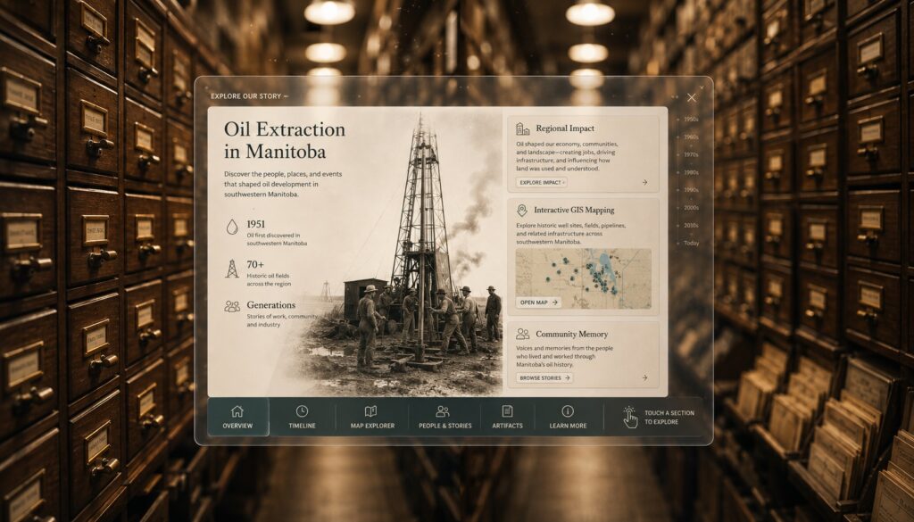
MOMIC tells the story of oil extraction in Manitoba, especially in the southwest corner of the province, where oil has shaped communities, work, land, and identity for generations.
Manitoba’s oil history dates back to the early 1950s. The Province of Manitoba notes that producible oil was discovered in southwestern Manitoba in the 1950s, and that the area has produced oil since 1951.
A history like that carries more than dates and production numbers.
It is about people, about land and about how industry changes a region, and how a region remembers that change.
For our team, the question was clear:
How do we make a complex history easier to explore?
At its core, this was a challenge in digital interpretation for museums: creating structure around archives, maps, community memory, and historical context without reducing the story to a single path.
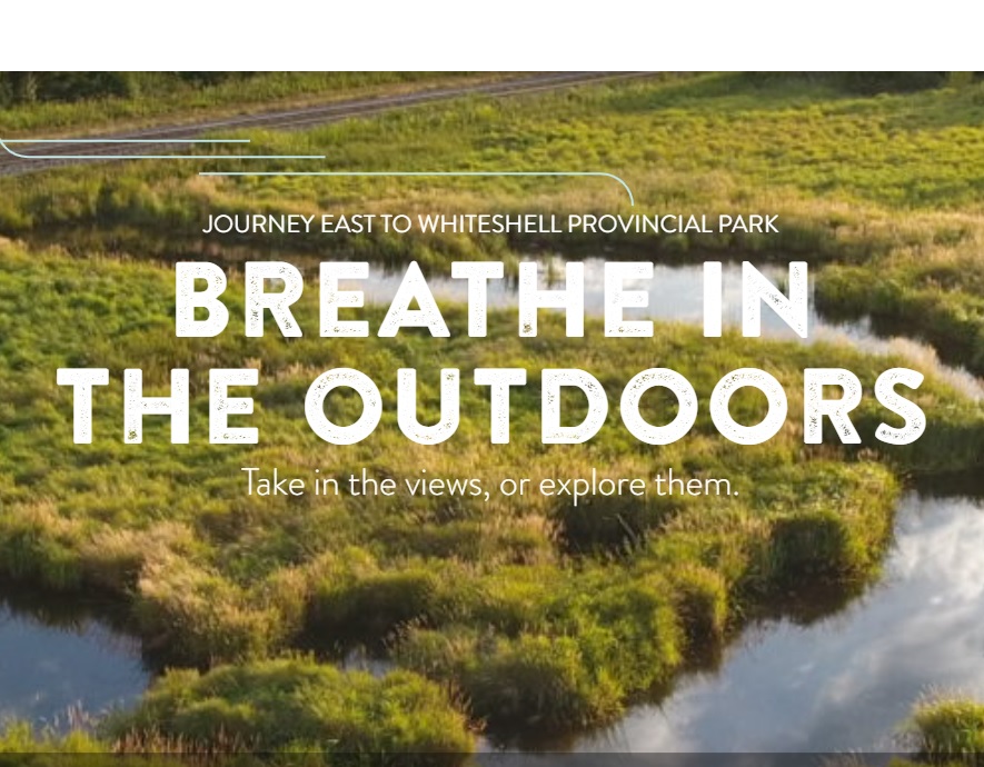
For Part 1 of this series, we looked at Explore the Whiteshell and how regional tourism UX can make a destination easier to search, plan, and understand.
Part 2 moves from tourism into interpretation.
The context is different, but the pattern is familiar: when information is complex, the digital experience has to create structure without flattening the story.
That is what made MOMIC such a meaningful project.
Project Snapshot
Project: Manitoba Oil Museum and Interpretive Centre
Sector: Museums / heritage / digital interpretation
Services: UX strategy, WordPress development, information architecture, GIS mapping, archive structure, future kiosk planning
Core Challenge: Make a layered history of oil extraction in southwestern Manitoba easier to explore without flattening the story
Primary Users: Museum visitors, researchers, students, local residents, educators, tourists
Live Site: Visit Manitoba Oil Museum and Interpretive Centre
What Pattern delivered:
WordPress-based interpretive platform
Story-focused content structure
Archive-friendly information architecture
Interactive GIS map using Government of Manitoba data
Points of interest to make oil extraction history easier to explore
Navigation designed for web use and future kiosk use
Flexible CMS structure for ongoing content growth
User pathways for casual visitors, researchers, students, and community members
The result:
Complex historical material became easier to navigate
Visitors can explore the story through narrative, geography, and archival context
Mapping helps connect oil history to real places and communities
The platform supports both online discovery and future in-gallery interpretation
MOMIC gained a flexible digital foundation for exhibits, education, outreach, and long-term public access
The Tension: History with weight, but no easy path in
Southwestern Manitoba’s oil story carries real historical weight.
The discovery and production of oil in the region helped shape towns, jobs, land relationships, family stories, regulatory debates, and local identity.
MOMIC was created to share that history and preserve stories connected to oil extraction in Manitoba. The organization grew out of a desire to interpret a part of Manitoba history that is significant, technical, and deeply tied to place.
That kind of story is hard to present digitally.
A casual visitor may want to understand the basics: where oil was found, why it mattered, and how it changed the region.
A researcher may want deeper access: maps, records, names, places, production context, and supporting material.
A local resident may be looking for memory: people they recognize, stories they have heard, or places connected to family history.
A student may need orientation: enough structure to understand the topic without getting lost in technical language.
The content itself had layers.
There were archival texts. Physical records. Historical maps. Industry references. Community recollections. Stories connected to surface rights and mineral rights. Broader conversations around regulation, land, toxic gases, and the impacts of extraction.
The challenge was organizing this material in a way that felt accessible to the public while still respecting the depth of the subject.
That required more than uploading content.
It required interpretation.
When history is layered, a single path through the material rarely works. Different users need different ways in. Some people want the story. Others want the source material. Others need geographic context before the history fully makes sense.
The experience had to support all of those entry points.
The Pattern Solution: Information architecture that respects the story
Digital interpretation is about giving people better ways into a story.
For MOMIC, the work started with structure.
The content needed to be organized so visitors could move through the material at different depths. Someone casually browsing needed a readable path. Someone looking for deeper historical or geographic context needed a way to keep going.
That meant thinking beyond standard website navigation.
The experience had to support two behaviours at once.
First, it needed to work as a story-based experience. Visitors needed to encounter the human side of the museum: the people, places, timelines, and community context that make the history understandable.
Second, it needed to work as a research and exploration tool. Visitors needed access to deeper material, including geographic information and map-based context.
This is where information architecture becomes interpretation.
The way content is grouped, labelled, connected, and surfaced shapes how people understand the story.
Our role was to create pathways that made the material more usable while still allowing the complexity to remain visible.
WordPress was chosen as the content management system because it gave the project a practical foundation for organizing and editing a large body of material over time. MOMIC needed a maintainable interpretive platform that could grow as new material, stories, and updates became available.
The navigation also had to support the way people would physically and digitally interact with the site.
One key design choice was the placement of the navigation menu at the bottom of the interface. This kept navigation accessible as users moved through the content and supported the possibility of future use on a physical interactive kiosk.
That is a small detail with a larger purpose.
Good UX often works that way.
The best decisions are practical. They remove friction. Help people stay oriented. They make the next step clearer.
For MOMIC, that meant helping users move through a large and layered story with more confidence.
Why maps change the way history is understood
Some stories need geography.
MOMIC is one of them.
Oil extraction happens in specific places. It affects land, communities, roads, farms, towns, and infrastructure. To understand the scale of oil extraction in Manitoba, visitors need more than text.
They need to see it.
That is why the interactive map was such an important part of the project.
Our team integrated an interactive map into the platform to provide a visual representation of oil extraction in Manitoba. Working with Government of Manitoba GIS data, we helped convert complex map data into a user-friendly experience with points of interest.
That kind of data is valuable, but it is not automatically accessible to a general audience.
A public interpretive experience has to translate the data into something people can understand and explore.
The goal is to help visitors understand what they are seeing, why it matters, and how it connects to the broader story.
For museums and heritage organizations, maps can do something text alone cannot.
They show scale, concentration, relationships between places.
They help visitors connect a story to the land beneath it.
In MOMIC’s case, mapping helped make the history more tangible. It gave users a way to understand oil extraction as a regional system, connected to real locations and real communities.
That is the power of digital interpretation.
It can connect narrative and data in the same experience.
The Long-Term Impact: Building beyond the browser
A strong digital project should solve today’s problem while leaving room for what comes next.
That was important for MOMIC.
The website needed to work for online visitors. It also needed to support future physical interpretation. From the beginning, the design had to be flexible enough to be incorporated into an interactive kiosk.
That changes the way a team thinks.
A website is often used alone, on a personal screen.
A kiosk may be used in a public space, with different expectations. People may be standing. They may be moving quickly or exploring with someone beside them. They may have only a few minutes before deciding whether to go deeper.
That means the interface has to be clear.
Navigation has to be easy to reach.
Content has to support quick entry and deeper exploration.
For MOMIC, this future-facing approach helped extend the value of the digital investment.
The platform was built for web traffic, but it was also built with future exhibit use in mind.
That matters for museums, interpretive centres, heritage groups, and regional organizations working with limited resources.
A digital platform can become the foundation for exhibits, kiosks, education, outreach, and long-term public access.
When built well, the same content structure can serve multiple contexts.
Online visitor.
In-person guest.
Student.
Researcher.
Community member.
Tourist.
That is where digital interpretation becomes sustainable.
Putting a Pattern into Practice
MOMIC was a way to make layered history easier to access, easier to navigate, and easier to understand.
The project asked us to work with archival material, community memory, industry history, geographic data, and future exhibit possibilities. It required structure, usability, and respect for the complexity of the subject.
That is the real work of digital interpretation.
You are shaping the way people enter a story.
For MOMIC, that meant building an experience that could support casual browsing and deeper research. It meant using maps to make place and scale visible. It meant thinking about how the platform could live online today and support physical interpretation tomorrow.
We helped turn a complex history into something people could explore.
Not by making the story smaller.
By giving people better ways in.
Categories
- Accessibility & Inclusive Design
- Awards, Media & Recognition
- Digital Governance & Risk
- Government & Civic Technology
- Hosting, Maintenance & Website Care
- Interactive Experiences & Digital Storytelling
- Museums, Heritage, & Art Organizations
- Pattern in Practice
- Research, Prototyping & Emerging Technology
- Websites, UX & Digital Platforms